Bob the Reader: a swipe-based reader for AI papers, built on a commute
My commute to work is a little under an hour each way, and for most of this year I have been quietly furious about it. Not the commute itself, which is fine, but the fact that I would step out of the train every morning having scrolled through a feed I could not name a single thing from. Two hours a day of attention, gone, and the most generous accounting of what I had done with it was that I had looked at images of food. The guilt was specific and recurring. I kept thinking, there is no way the only available shape for an hour of phone time is the one I keep falling into.
What I actually wanted, in the abstract, was to read more papers. What I actually did, in the concrete, was open Twitter. The gap between those two things is not a willpower gap. It is an interface gap. Reading papers requires you to open a tab, find a PDF, decide whether to read it, scroll, fail, close the tab, feel bad. Scrolling Twitter requires you to flick a thumb. The interface is doing all of the work, and the interface for papers is, charitably, hostile.
So I started thinking about what it would take to make reading papers have the shape of the thing I actually do on the train. The answer that kept coming back to me was the swipe. Tinder figured out years ago that a single binary gesture, applied to a stack of cards, is one of the most addictive interaction patterns ever designed. The reason I was losing two hours a day to a feed was not because the feed was good. It was because the swipe is good. And nothing about the swipe requires its content to be people. You can put anything on the card. So I put papers on the card, named the panda that lives behind the cards Bob, and spent the next several weeks of commutes building him.
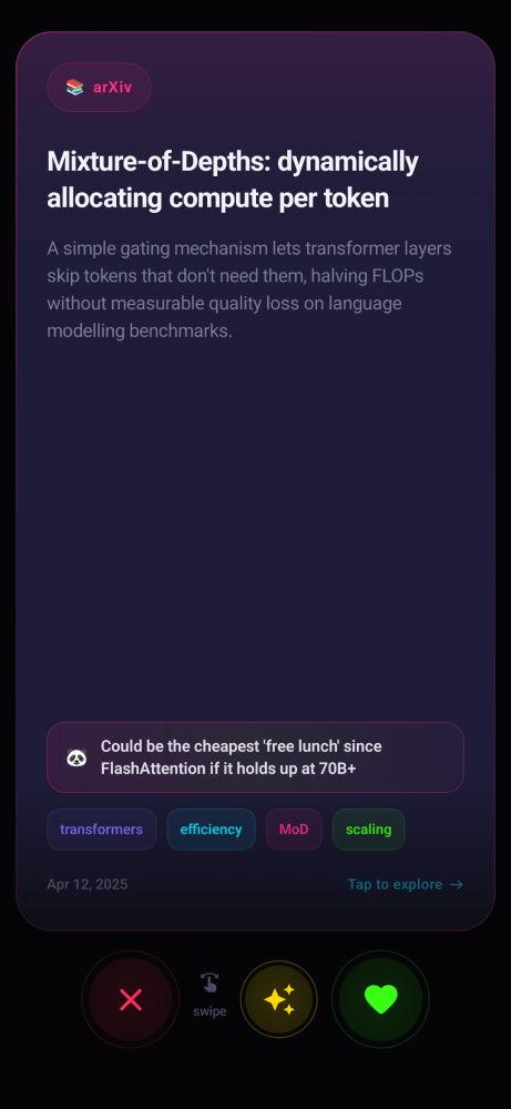
The fun part, and the part this post is about, is what had to be true on the backend for the swipe to actually be useful. A swipe over garbage is just a fidget toy. The whole project lives or dies on whether the next card you see is one you actually want to see, and whether the panda on the other side of it has anything intelligent to say. Both of those are AI problems, and that is what I want to walk through.
The card is the unit of personalization, so the card has to be cheap
Every morning a job pulls fresh papers from arXiv and Hugging Face into a Mongo collection. I do not store the PDFs, because the PDF is not the product. The card is the product. Each card needs four things: a clean title, a tight summary you can read in the time it takes to swipe, a set of normalized topic tags, and a one-line opinionated take that I generate ahead of time and bake into the card. That last piece is what separates the experience from a feed reader, and I want to come back to it.
The summary I get for free, because the abstract is already a summary written by people whose academic survival depends on it being a good summary. I run each abstract through a small cleanup pass that strips LaTeX residue, normalizes the whitespace, and trims it to roughly two hundred words, but the structure is the author's. The tags are generated from the abstract by a small classifier prompt that picks from a controlled vocabulary of about sixty topics. I do not let the LLM hallucinate new tags, because the moment you let tags drift, your personalization signal becomes noise. Every paper has to be projectable into the same fixed-dimensional space, otherwise the recommender at the bottom of this post does not work.
For the long-form parsing that powers the chat, I run the PDF through Docling, which gives back structured text with section boundaries, headings, and figure captions still attached to the right paragraphs. Section structure matters more than people give it credit for. If you chunk a paper without preserving its skeleton, you can ask a question about the experimental setup and get back a chunk from the related work section, and the model will happily answer using the wrong context. Keeping the skeleton intact is the difference between retrieval that feels like reading and retrieval that feels like grepping.
Each paper gets sliced into roughly paragraph-sized chunks with a small overlap, embedded with a sentence transformer, and dropped into a FAISS index that is keyed per paper. There is no global index. Every paper has its own little vector store, because the chat is always scoped to the paper you are currently looking at, and a global index is a tax I do not need to pay.
The verdict pill, or, why a single line is the whole personality
Look at the card again. The little shimmering pill near the bottom, the one that reads something like could be the cheapest free lunch since FlashAttention if it holds up at seventy billion params. That single line is doing more work than anything else on the screen, and getting it right is the entire reason the app does not feel like a feed reader.
I generate the verdict at ingestion time, never at view time. I do not want a model in the hot path of a swipe gesture. The cost is amortized across every viewer of every card, and the latency budget at swipe time is zero milliseconds, which is a budget you cannot meet with a remote model call. So the verdict is precomputed, stored on the card, and rendered instantly. This is a design choice that quietly governs a lot of the rest of the system: anything the user sees as part of the core gesture loop has to be precomputed or local.
The prompt that generates the verdict is short and opinionated. It gets the title and the abstract, and a style guide that tells the model to write in the voice of someone who has read three thousand papers and is mildly tired but still curious. No hedging, no this paper proposes a novel, no academic throat clearing. Fifteen to twenty words, must contain a stake, must commit to an opinion. The interesting empirical finding here, and one I did not expect, is that the temperature matters more than the prompt. At 0.7 the verdicts are flavorless. At 1.1 they are unhinged. The pocket of good verdicts sits at around 0.95, and that is where the panda started writing things I actually wanted to read. I now believe that tone is a sampling problem and not a prompting problem, and I am slightly evangelical about it.
The chat is a retrieval-augmented contract, not a vibe
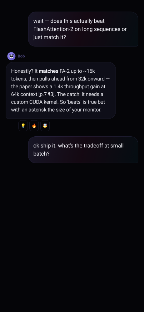
Tap a card and you land in a conversation scoped to that one paper. Under the hood this is a fairly standard RAG pipeline with a few opinionated choices that I think are worth defending.
The user's question first goes through a rewrite step that pulls in the last few turns of conversation. This sounds boring but it is essential. Without it, a follow-up like and at small batch? retrieves the wrong chunks, because the embedding for that fragment has no signal in it. The rewrite step uses a small fast model to reformulate the question into something self-contained, and that reformulated query is what hits FAISS. The original phrasing is what Bob actually answers, but the retrieval works off the rewrite. This separation is one of the things you only notice when it is missing.
The retrieval pulls the top-k chunks for that paper, with their section headings and approximate page numbers attached. Those go into the context window along with the system prompt that defines Bob, and the response streams back token by token. I run a deep mode and a fast mode. Fast mode pulls four chunks, uses a smaller model, and starts streaming in under a second. Deep mode pulls eight chunks, uses a larger model, and is willing to take five seconds if it means a better answer. The toggle is a single pill above the input field, and the user picks based on whether they are killing time or actually trying to learn something.
The piece I am most happy about is the citation contract. Bob is not
allowed to make a factual claim about the paper without bracketing
it with a marker that points at the specific page and paragraph he
pulled it from. You see those in his replies as [p.7 ¶3].
They are not decoration. They are the entire trust mechanism. The
system prompt explicitly instructs the model to insert them, the
output is post-processed to strip any marker that does not
correspond to a real retrieved chunk, and tapping the marker opens a
sources expander that shows you the actual snippet. If Bob says the
method gets a 1.4 times throughput gain at 64k context, the marker
tells you exactly where in the paper to verify that. Before
citations, the chat was vibes. After citations, it became a tool I
actually used to decide whether to read a paper end to end.
The status pool, because thinking dots are an admission of defeat
While the response streams, the UI shows a small status line above Bob's bubble. Most chat apps say thinking or pulse three dots in this slot. I find this depressing. The dots tell you nothing. They are a loading spinner pretending to have a personality.
So as part of the rewrite step I run a tiny intent classifier that tags each question as one of about ten categories: methodology, results, limitations, comparison, identity, greeting, summary, followup, opinion, generic. Each intent has its own pool of four to six handwritten status lines, and the UI rotates through them while the response streams. Ask about methods and you see Bob is decoding the architecture, then Bob is tracing the training pipeline, then Bob is reading section 3 carefully. Ask about results and you see Bob is auditing the benchmarks, then Bob is calling out the cherry-picks. The classifier runs in the same call as the rewrite, so the intent tag is free. The status pool turned out to be the single most loved feature in early feedback, which is funny because it is also the smallest piece of ML in the entire system.
The recommender, which is where the math actually lives
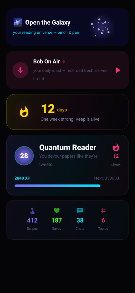
I never ask the user what topics they like. I do not believe people know, and even if they do, the answer they would give in an onboarding flow is not the answer their behavior would give. So the personalization is built entirely from swipe events, and this is the piece I want to spend the most time on, because it is also the piece most likely to be hand-waved in posts like this.
The model is a per-user vector in tag space. There are about sixty
tags in the controlled vocabulary, so each user is a sixty-dimensional
score vector that starts at zero. Every swipe updates it. A right
swipe on a paper with tags {transformers, efficiency,
long-context} adds a positive increment to those three
dimensions. A left swipe subtracts a smaller positive increment. A
super swipe adds a much larger positive increment. The asymmetry is
deliberate: a skip is weak negative evidence, because most skips are
due to mood or context rather than genuine dislike, but a save is
strong positive evidence and a super swipe is even stronger.
Concretely, the per-tag updates are weighted roughly 3 for super
swipe, 1 for save, and -0.3 for skip.
On top of that base update I apply a time decay. Every score is multiplied by a factor close to 1 each day so that older preferences slowly fade. The decay constant is set such that a tag boost from a single save loses about half its weight after roughly thirty days. This is what lets the recommender follow you when your interests drift. If you spent six weeks obsessed with retrieval and then pivoted to RL, the recommender catches up within a few days rather than a few months, because the retrieval scores are decaying while the RL scores are climbing.
Scoring a candidate paper for the feed is then just an inner product. For each new paper with tag set T, the candidate score is the sum of the user's per-tag scores for tags in T, divided by a small normalizer that is a function of how many tags the paper has, so that papers with many tags do not get an unfair boost just from surface area. To this base score I add a recency term that decays over the freshness of the paper, and a small diversity bonus that penalizes the candidate if its top tag matches the top tag of the previous three cards in the queue. Without the diversity bonus you get tag tunnels, where four cards in a row are all about retrieval and you stop trusting the feed.
To stop the recommender from collapsing into your top three tags forever, I keep a small exploration budget. About one card in every seven is sampled with a Boltzmann distribution over the full candidate pool with a temperature that is high enough that the card can come from anywhere. This is the explore part of an explore-exploit tradeoff, and it is what lets the system surface papers from tags you have never engaged with. The empirical effect is that the topic radar on your profile slowly grows new spokes over time rather than calcifying around whatever you happened to swipe on in your first session.
The radar visualization itself is a direct projection of the score vector. Each spoke is a tag, the spoke length is the normalized score, and a slight smoothing bias toward your top three tags makes the shape stable enough to be satisfying to watch evolve over a week. None of the math here is novel. All of it is small. What matters is that every number on the profile screen is a function of something the user actually did, which is what makes the screen feel honest.
The UI, briefly, because it is the smallest part
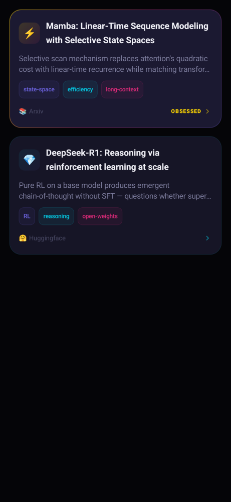
The app is Jetpack Compose. There is one activity, one ViewModel, a few flows for the feed, the chat, the bookmarks, and the conversation list. The swipe stack is a custom gesture detector that drives a few animated values, with the horizontal drag tied to the SAVE and SKIP overlay alpha and the vertical drag tied to a separate super swipe overlay. There is exactly enough haptic feedback to make the gesture feel committed and not one buzz more. Everything else is layout. The visual language is borrowed from premium dating apps because that is the closest design lineage that already solved the swipe-stack problem, and there is no reason to reinvent it.
What this whole thing is actually about
Bob the Reader is, on paper, a small mobile app with a swipe feed and a chat. What it actually is, for me, is an experiment in whether you can take an interaction pattern that was optimized for attention capture and aim it at something useful. I wanted my commute back. I built a thing that gives me my commute back. I now step off the train having actually read about three to five papers worth of context, with a few of them saved for the evening, and the Twitter app still on my phone but quietly unopened.
None of the individual pieces here are flashy on their own. There is no new architecture, no custom-trained model, no paper to cite. What there is, instead, is a set of small, deliberate choices that each took longer than they look. Pinning the verdict to a temperature of 0.95 took an evening of A/B reading. The citation contract took two rewrites of the system prompt and a post-processor that strips markers the retrieval cannot back up. The recommender numbers, the asymmetric swipe weights, the half-life on the decay, the size of the exploration budget, are not theoretical. They are the values the feed converged on after weeks of staring at my own card stack on the train and asking, why did this one show up, and would I have wanted it to. Most of the engineering effort on this project is invisible because it is in the calibration, not in the code. That is the part I am most proud of and the part that is hardest to convey in a screenshot.
The bet underneath all of it was on the framing. Hide a retrieval-augmented research assistant inside an interface that your thumb already knows how to use, give the personalization signal a tight loop with the gesture, and a quiet amount of work every day starts to compound. If there is a single thing I would point at as the most underrated lesson from building this, it is that the interface is not the wrapper around the model. The interface is the product, and the model is what allows the interface to exist.
Bob the Reader is on Android and free. The backend is closed for now, but I plan to open source parts of it once the interfaces settle. If you end up using it, or have ideas for what should be on the next card, I would love to hear from you.